Mobile Search Rankings
A few months ago, there was a lot of hype surrounding “Mobilegeddon” as people prepared for Google’s mobile friendliness update only to be a bit flummoxed when there wasn’t much apparent change in search results. Does this mean that mobile friendliness isn’t as important as we thought? Absolutely not.
To give you an idea of how prevalent mobile searches have become, the article, Why Make a Website Mobile Friendly? from Google Developers shares that 94% of people in the States with smartphones search for local information on their phones. And what’s more intriguing is that 77% of mobile searches occur while people are at home where their desktops are most likely close by.
With these statistics in mind, here are some mobile ranking factors to consider in order to make sure your website is properly optimized for mobile users.
Don’t block JavaScript, CSS, and image files in robots.txt
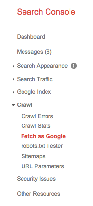 Blocking these files in your robots.txt will prevent Googlebot from optimally rendering and indexing your webpages. Using the “Fetch as Google” feature in Google Search Console, you can see how Google is indexing and rendering your site. You might also want to test your robots.txt file and mobile pages using Google’s robots.txt Test and Mobile Friendly Test tools.
Mobile-only 404s
A common problem that can occur if you have separate mobile and desktop URLs is mobile-only 404 errors. This happens when a given webpage works properly on desktop devices but shows a 404 error on mobile devices. Check the Crawl Errors section of Google Search Console to see if your site has any Soft 404s. If you’re having this problem, it’s possible that the desktop URL isn’t redirecting to the mobile URL.
Fix faulty redirects
Another problem that can happen with separate mobile and desktop URLs is that a user may request a certain webpage on a mobile device, and the equivalent desktop URL will redirect the user to the mobile homepage instead of the mobile subpage he or she requested.
To fix this, make sure that desktop URLs redirect to their equivalent mobile URLs.
Irrelevant cross-links
A third consequence of having separate URLs for desktop and mobile devices is irrelevant cross-links. An example of this would be if a mobile URL pointed to the desktop’s homepage URL.
Again, make sure each link on your site points to the correct equivalent link.
A quick note: Mobile-only 404s, faulty redirects, and irrelevant cross-links are easily avoided if you use a responsive web design as opposed to separate URLs. With a responsive website, users are shown the same content regardless of the device they’re using.
Don’t use interstitials to display your native app download, any advertisements, etc.
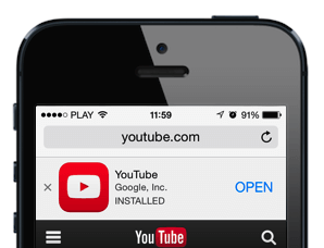 If you’ve ever visited a website over mobile that has an app, you may have noticed a banner at the top of your screen providing you the opportunity to download the app. This feature is an HTML banner and is the desirable way to display native app downloads, newsletter sign-ups, and more because it places the content inline with the rest of your webpage.
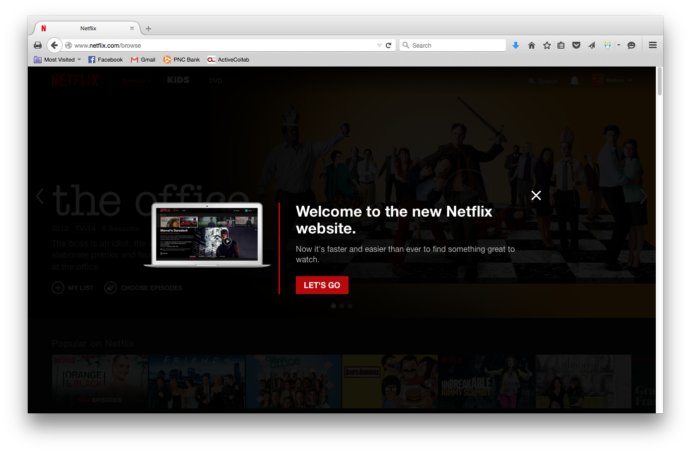
What you want to avoid are interstitials, which interrupt the user experience. For example, when I go to Netflix on my desktop, I get this message that pops up. Before I can select something to watch, I have to exit out of this interstitial message letting me know that the new Netflix site has made updates to improve user experience (which is ironic considering that this notification itself is doing the opposite of improving my experience by interrupting me). But I digress…
Whether it’s desktop or mobile, try to avoid using interstitials by using Smart App Banners for Safari or an HTML banner/image that functions as a link. For Android apps, you can use app indexing.
Slow mobile pages
Users are very demanding when it comes to speed. If you’re mobile pages load too slowly – basically anything less than immediately – users can become impatient. You can use Google PageSpeed Insights to check if there is anything slowing down your mobile site. Focus on the items listed under the “Should Fix” section.
Unfriendly mobile format
Take a look at the Google Analytics stats for your mobile pages. If you see a much higher bounce rate, conversion rate, or time on page, you may want to adjust the amount of information each landing page provides before the user has to scroll on a popular phone. For instance, for a product page, the user should see the product name, short description, price, options, image views, ratings, and any specials before having to scroll. While usability is not clearly identified as a ranking factor, it will certainly boost conversions to pay attention to this data and make adjustments accordingly. These changes also improve bounce rate, conversation rate, and CTR. Therefore, it will also help to indirectly improve rankings.
Finally, make sure video and animated content formats are compatible with mobile devices
Certain video formats aren’t compatible with mobile devices. Two examples are any license-constrained media or anything that requires Flash player. Google recommends using HTML5 tags instead.
For more information about mobile search, check out our posts about mobile Internet marketing and mobile application development.